
A new year has arrived, and with it a new look for NPI.
Today, we’re unveiling a new iteration of our durable tricolor logo, using a palette inspired by the region we serve and love. Take a look:
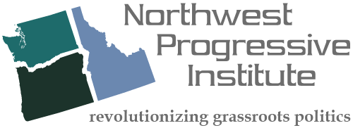
We call this palette “Forest & Mountains” because it was inspired by one of our favorite photographs of Mount Rainier, the tallest peak in the Cascade Range.
Each of the colors used for the states in “Forest & Mountains” was sourced from this photograph, which was added to the NPI image library in 2012.

Washington is depicted with a shade of brilliant turquoise, Oregon with a shade of dark green, and Idaho with a shade of blue-gray.
This is the second iteration of our logo to be adopted as NPI’s default trade dress.
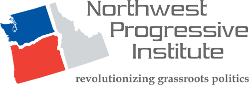
The original NPI logo, designed by our incredibly talented friend Miles Kurland in 2006 for NPI, used a red, white, and blue color palette (with gray substituted for white on white backgrounds), in homage to the original Northwest Progressive Institute website, which debuted on August 22nd, 2003.
It is a testament to Miles’ skill as a designer that the logo he created for NPI has wonderfully withstood the test of time, and can be easily refreshed at any point with the adoption of a new color palette (which is what we’re doing today).
This refreshed logo will serve as our trade dress going forward. We hope you like it and enjoy it every time you see it. Happy New Year 2017!