
On this day in 1777, the Continental Congress of the United States of America adopted the flag that would ultimately evolve into the Stars and Stripes we know and see everywhere today. Since 1916, that event has been commemorated as Flag Day in a myriad of ways in communities across the country.
While Flag Day in the United States honors the adoption of the nation’s flag, it’s also presents an opportunity to celebrate flags of all kinds and discuss proposals to improve flags. Today, in honor of Flag Day, we will be sharing and commenting on two flag improvement proposals that intrigue us and merit consideration.
We’ll start with Daniel Quasar’s concept for a revamped Pride flag.
June happens to be Pride Month, when the Pride flag is most commonly flown, so this is an ideal time to talk about the Pride flag and the symbolism behind it.
The original rainbow Pride flag looks like this:

It was designed by Gilbert Baker and dates back to 1978.
It’s a classic flag, to be sure, and not one that suffers from a design flaw.
(For a gallery of other Pride flags, see this Wikipedia page.)
However, graphic designer Daniel Quasar has nonetheless redesigned it to emphasize progress, diversity, and inclusion. Instead of adding more stripes of different colors, as others had done, Quasar’s design adds a chevron.
The black and brown stripes represent underrepresented and disadvantaged LGBTQ+ communities of color, along with the colors pink, light blue and white, which are seen on the transgender Pride flag.
Quasar rolled out his redesigned flag last year and it has aged very well.
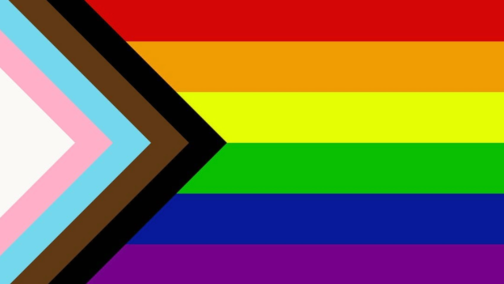
What we like about this redesign is that it honors the original while adding a tasteful, modern twist. The chevron speaks to where the movement for equal rights is today, and what challenges lie ahead in ensuring that everyone is free to live a happy and prosperous life no matter their sexual orientation.
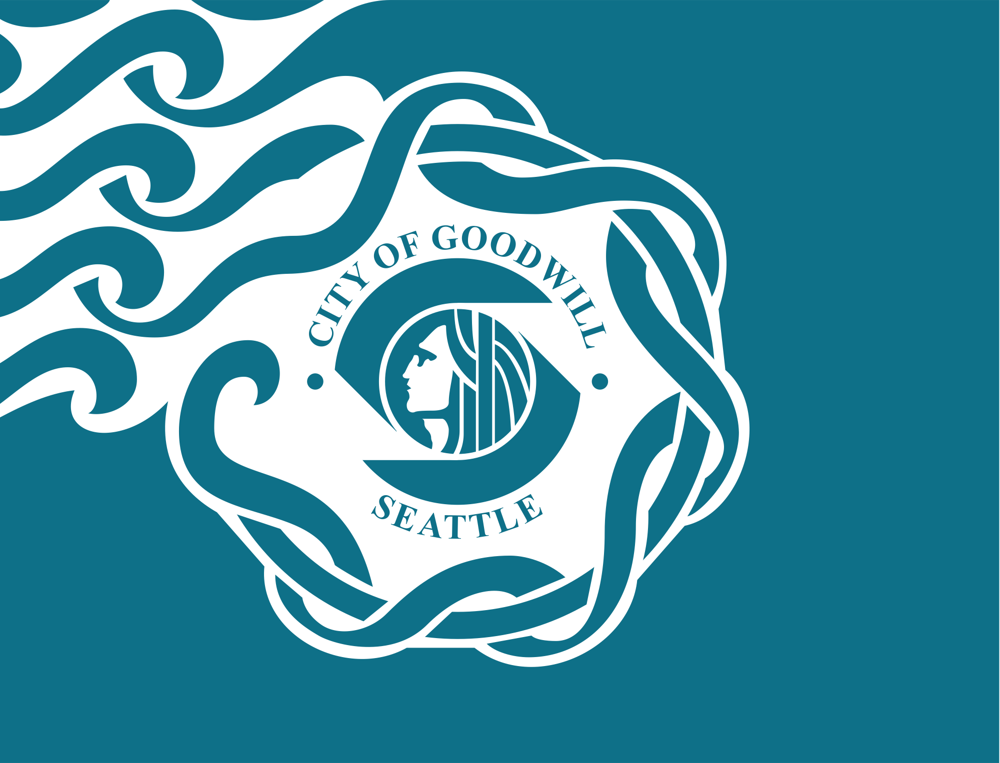
Moving on, let’s talk about the flag of the City of Seattle, which has been criticized as ugly and violating the principles of good flag design.
The original Seattle flag dates back to 1990. David Wright created the flag for the Goodwill Games. It was never mass produced and is not widely used as a symbol of the city. (The flag does, however, incorporate the more widely used seal.)
Here’s the original Seattle flag:
Graphic designer Riley Raker decided to take a shot at redesigning the flag without starting over from scratch. Instead of going for something completely different, he chose to simplify and streamline. The result is excellent. Elegant.

“Separating the colors with rigid vertical lines didn’t feel appropriate so I referenced the seal with curved separations,” Raker explains. “Once I had the elements of the design, I looked at dozens of color variations, but the most obvious choice seemed best. I added green to complement the teal and white of our current flag.”
This tasteful redesign would serve the City of Seattle well were it to be adopted.